
CSS Media Queries
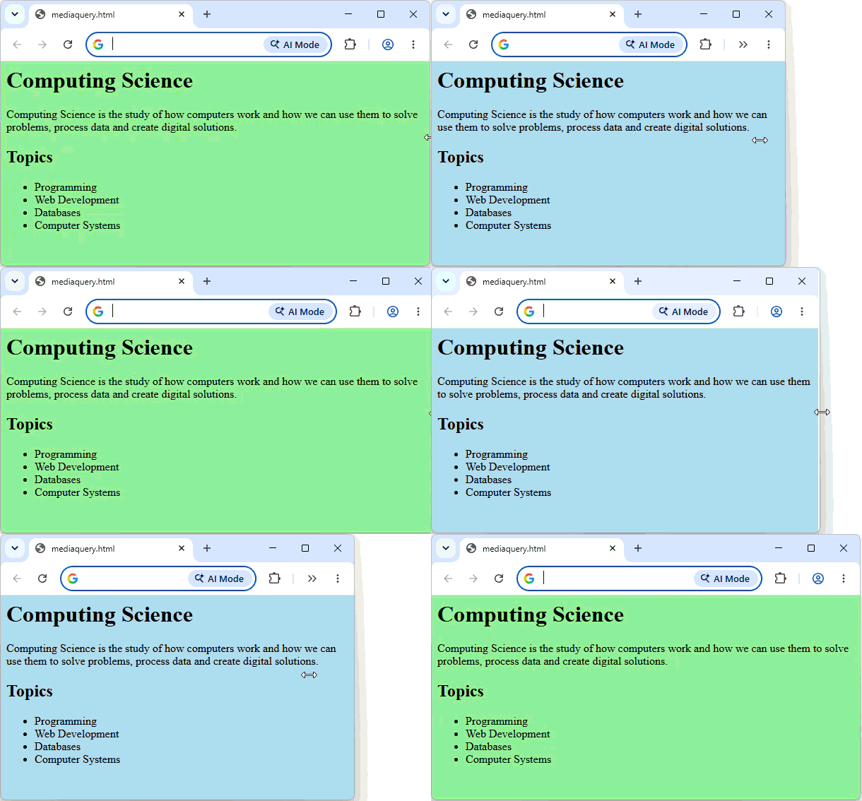
Media queries allow a webpage to change its CSS depending on the screen size or how the page is being viewed.
They are used to create responsive webpages that can have different layouts on large and small screens.
At Advanced Higher, you need to know:
- screen – used when the webpage is being displayed on a screen.
- print – change how a webpage looks when it is printed.
- max-width – sets the maximum screen width at which the media query will apply.
Example 1 - Screen and max-width
body { background-color: lightgreen; }

@media screen and (max-width: 600px) {
    body {
        background-color: lightblue;
    }
}
Example 2 - Print
body { background-color: lightgreen; }

@media print {
    body {
        background-color: lightblue;
    }
}